
More is More when it comes to bead colors!
You know that saying, ‘less is more’? Well, in most cases it is a great guide as you approach life. But, if you’re trying to create a beading color scheme that is going to wow, then I would argue that it’s not true. In fact, I hope to convince you, today, that ‘more is more’ when it comes to bead colors.

The temptation to play small…
I think when we first start choosing color schemes for our beadwork, most of us try and play safe. In other words, we are tempted to ‘play small’.
If you know anything about the color wheel, then you might already know a few rules. You might know that putting two opposing colours together will create a good combination. Or, choosing two colours that sit next to one another can also work. Perhaps, you go even ‘smaller’ and ‘safer’, and just stick to different shades of a single color.
So, you apply those rules, and you’ll get something that looks good..
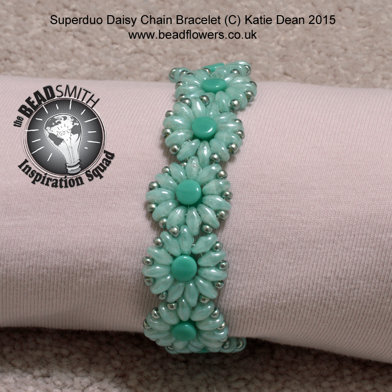
Click here to get the daisy chain bracelet pattern
…but it may not really ‘wow’ your audience. In the bracelet above, I used three different, quite similar, shades of turquoise. It looks nice enough, but I could do more with my choice of color.
Don’t get me wrong, I’m not suggesting that there is anything wrong with a simple color scheme. It can be very pleasing, very soothing to the eye. But, if you stick it in a gallery with a lot of bolder schemes, it’s likely to get lost.
Taking things up a notch
Many years ago, I entered a contest in which the challenge was to create a piece of jewellery using a monochromatic colour scheme. So, that means using a single colour, but choosing different shades.
And yes, this is quite a challenge!
Here is the necklace I created. It was awarded third prize, so I guess I managed to create some level of interest within my (again, turquoise!) monochromatic scheme.

Basically, what I am trying to say is, even if you are only working with a single color, the same rule applies. ‘More is more’ when it comes to bead colors. Even if those colors are simply different shades of a single color.
Why more is more when it comes to bead colors
But what happens if you start to get a little bolder. What if you mix in a completely different color? Or maybe, you mix in some different shades of that different color as well?
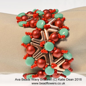
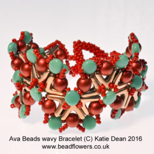
Click here to get your copy of the AVA beads wavy bracelet tutorial
Suddenly, your viewer’s eye has a lot more to think about.
In the case of the bracelet above, the turquoise has now just become a highlight. It accents a path around and across the design. You’ve then got shades of red/orange to act as a background. But even within this, the different shades help to accent the different beads in the design.
Or, how about you go even bolder?
Instead of taking just two colors and playing with shading, what if you take five completely different colors?
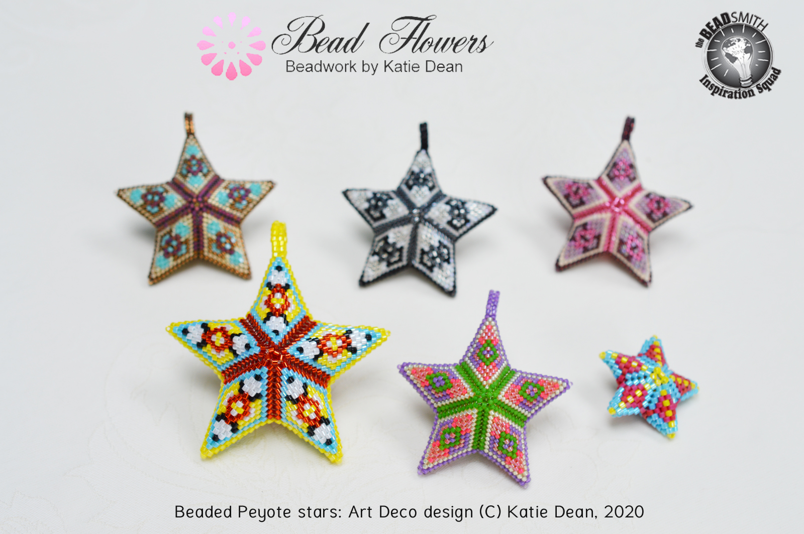
Click here to get the pattern for this beaded star design
With each of the stars above, you’ve got five different colors. In some cases, they are five completely different colors – as with the largest star. In other cases, you’ve got a combination of different colors, but also different shading within some of the colors.
How is that for creating interest?
The danger of overwhelm
Now, you may be wondering how many is ‘too many’. As with anything in life, you can always get too far to any extreme. So, it is certainly possible to add in so many colors that you create an overwhelming mess, rather than a design with interest.
But as for the precise number, well, I don’t think there is a formula here. You see, the number of colors you use is only the first part of what it takes to create a great color scheme with your beads.
Just as important as you choice of color, is the balance between the colors.
So, that is a topic I’m going to look at in more depth in another blog post. (Don’t forget, you can check out all my posts on color by using this link).
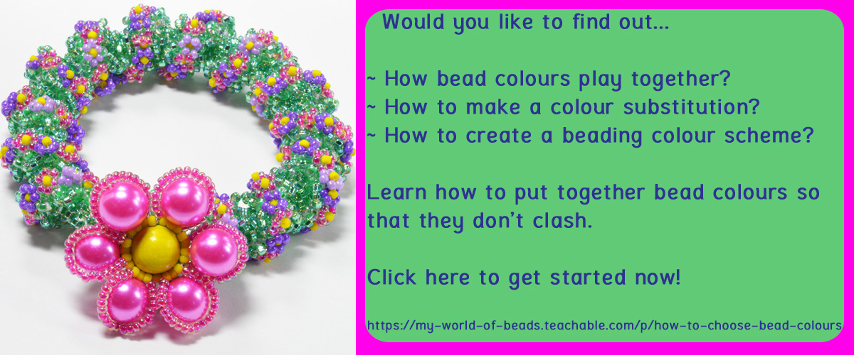
Meantime, if you want to begin perfecting your bead color schemes today, why not take one of my online classes?
This short class, ‘Bead colour combinations’, is designed to teach you how to put together a brilliant color scheme using five colors. It’s suitable for any level of experience. You can work on it from the comfort of your own home and in your own time. It also includes some beading projects for you to put your color schemes into practice immediately. So, if that sounds good, click here to find out more and start the class whenever your ready.
And hopefully that has given you some food for thought. Next time you’re putting together a bead color scheme, don’t forget to go big!


I am trying to find the link to join that newsletter. However, the page that says it has the link is not working.
You can use this link to join my newsletter, Anne. Thank you for asking. https://beadflowers.co.uk/bead-flowers-mailing-list/