
2020 Colour of the Year
OK, so we’re a quarter of the way through this year. Maybe I’m a bit late in talking about the 2020 colour of the year. But it’s always good to have a conversation about colour! In fact, one of the mailing list members was asking me about colours just the other day. (Click here if you want to join the mailing list and claim your welcome gift)

In previous years, I’ve talked about Pantone’s colour of the year. This is a well-known (much anticipated) colour choice, which you will most likely see come to prominence in fashion and design arenas.
Well, this year, Etsy has joined the party! For the first time, they too have announced a colour of the year. I believe this is designed to help Etsy makers and sellers stay on trend.
So, what are these trendy colours?

Pantone’s 2020 Colour of the Year
This year, Pantone has chosen ‘Classic Blue’. This timeless, elegant colour has been chosen to highlight the desire for constancy and dependability in an increasingly wild world. (Little did they know what Covid-19 was about to unleash on us all!).
It is designed to evoke the sky, and make us think more deeply and increase our perspective, according to the executive director of Pantone’s Colour Institute, Leatrice Eiseman.
Incidentally, this is also a very gender-neutral shade. Perhaps a reflection of the gender discussions that have been going on all around us in recent years…?

Etsy’s 2020 Colour of the Year
Etsy’s colour choice has been both reflecting and driving searches on their website. Chartreuse is intended to increase energy and encourage unconventional thinking.
It is certainly a colour that makes a statement! (And that could be one that you either love or hate!)
What does this mean for you?
Why would you be interested in these trends? Do you need to know about them for your beadwork?
Well, that’s really up to you. If you sell a lot of work, then maybe you should be interested. If Etsy is seeing an increase in people looking for products that include chartreuse, then could you use this trend? Maybe you include more of this colour in your own beadwork.
Coincidentally, when you come to think about how colours work together, both these interact nicely. Why is that? Well, they sit next to one another on the colour wheel. (If you need to find out about the colour wheel, check out this post). They provide the kind of contrast that will make a real statement, but remains easy on the eye. Particularly if you balance them, using the two in different proportions, maybe adding in a third colour (something a little more muted…perhaps a deep brown?) to increase interest.

My recommendations for colour combinations to try
Now, the first rule of colour is: if you like it, it’s ok.
Basically, what I’m trying to say is, don’t get hung up on ideas of ‘right’ and ‘wrong’. Any colour combination can work if it’s carefully thought through. The secret to a good colour scheme isn’t purely about the colour choices, but about the balance in the way you use them. If you want a bit more information about that idea, then check out this blog.
So, what I am about to share is my personal reaction to the 2020 colours.
Chartreuse
When I see chartreuse, I immediately want to pair it with a bright pink. This creates a truly bold statement, playing on the idea of opposites on the colour wheel. It’s actually a combination I’ve used in a lot of designs in the past.

Click here to get the ‘Fiesta’ necklace beading pattern
Now, you could use chartreuse with other shades of green. Because of the bold statement it makes, you’ll probably want to use it sparingly to create highlights. Used this way, it can really add some ‘zing’ to a more muted colour palette. I’d love to show you what I mean there, but it’s a colour combination I have yet to try out in reality…
Classic Blue
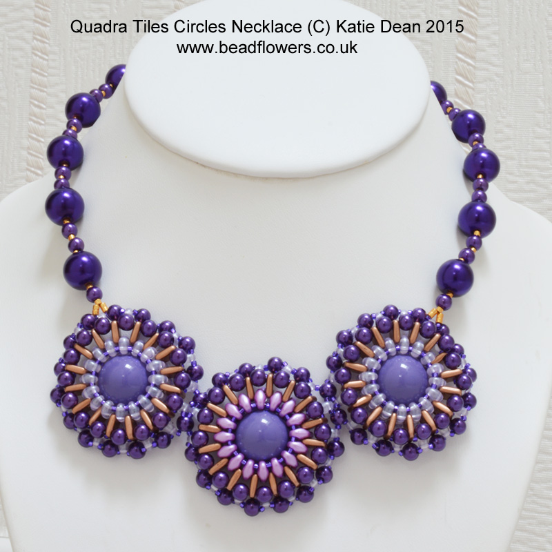
When it comes to classic blue, my instinctive reaction is to pair this with other shades of blue, or maybe greys, white and silver. I think the elegance of this colour makes me react a little more conservatively. So, this kind of colour scheme is going to be a lot more muted. Take a look at this bracelet, for example…

Click here to get the seafoam bracelet pattern
In that example, I made the blue the predominant colour, just adding pale highlights. But it can also work the other way around.
The blue is bold enough to be used as a highlight colour, preferably against lighter shades. This is something I tried in this necklace…

Click here to get your copy of the netted bubbles necklace
So, that’s just my opinion. What colours would you pair with the 2020 colour of the year choices? Leave a comment down below to share your ideas. And, if you’re interested in colour theory, don’t forget to check out this section of the website. It’s dedicated to bead colours!
If you need some extra help with finding bead colours that work together, then take a look at this online class. It could be just what you need.


I’d love to learn more about color!