Bead Colour Combinations: How They Work
The first rule of bead colour combinations is there are no rules! Well, that’s not strictly true – scientists and artists have spent years trying to work out colour theory so they can create hard and fast rules to give all the right answers. The problem is, those rules are so complicated that you can easily drown in them! So if I’m not going to give you a definitive answer about bead colour combinations, what am I doing writing this blog? You may well ask!
I felt obliged to write this after I had completed the Quadra Tile and Twin Hole beads. So here is the story…
A Tale About Bead Colour Combinations
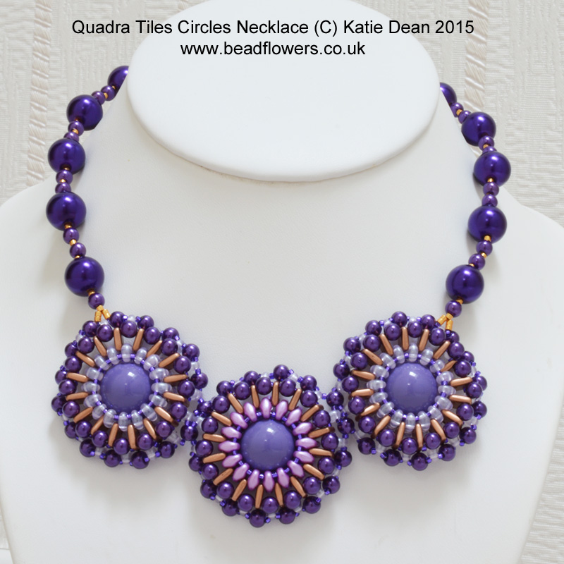
My colour choice seemed obvious. The dress was plain purple, so all I needed were all the purple beads in my stash…simple! First problem, I had no purple Quadra Tiles. Since I was working on a bank holiday and needed the necklace then and there, I wasn’t going to be able to buy any beads.
However, I looked through my Quadra Tiles collection and I found that I had some in gold. If you refer back to the basics of colour theory, then gold is a great option to go with purple. Yellow (gold) and purple sit on opposite sides of the colour wheel, so they are complementary colours. 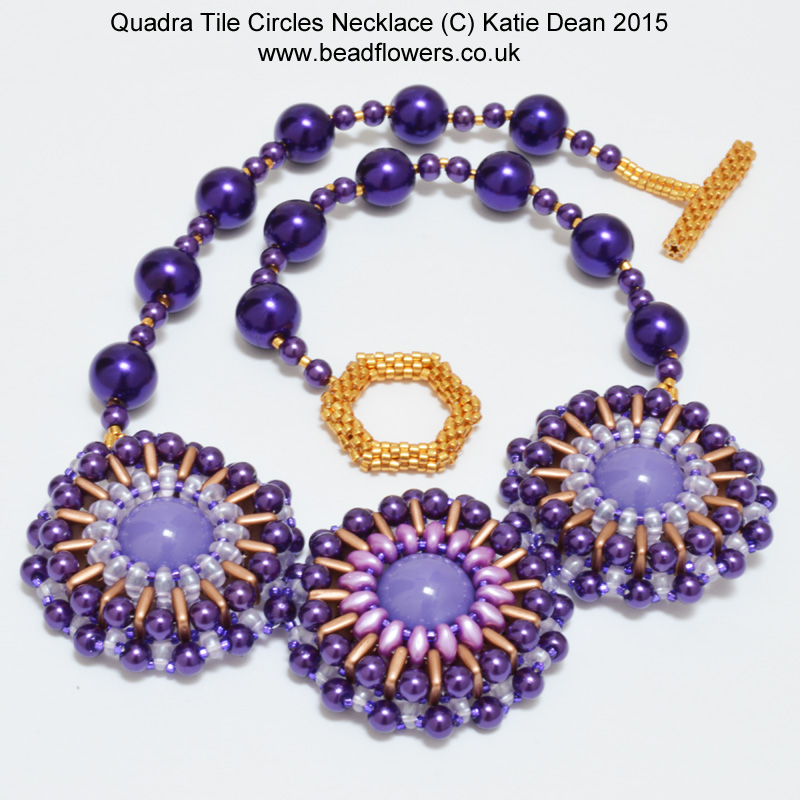
Click here if you want to take my online class, ‘How to choose bead colours’
A couple of tips
It is also a good idea when you are choosing colours to pick a dominant colour and then something that you can use as a highlight. If you use a totally equal balance of two colours, the design can appear less interesting. So, here I had my dominant purple and my highlight of gold.
If you have been beading for any length of time, you will have noticed that there are certain colours of bead that are hard to come by. This is purely a vagary of manufacturing processes, so it’s not likely to change any time soon. Unfortunately, purple is one such colour that is notoriously difficult to find.
The pearls I had in my stash were a brilliantly, vibrant purple, perfect for my dress. However, I had no other purples in the same shade. The dome beads were a completely different shade – much more blue, although they called themselves ‘purple’. I then had two different shades of Twin Hole beads. But both were more ‘lilac’ or ‘mauve’ to my way of thinking.
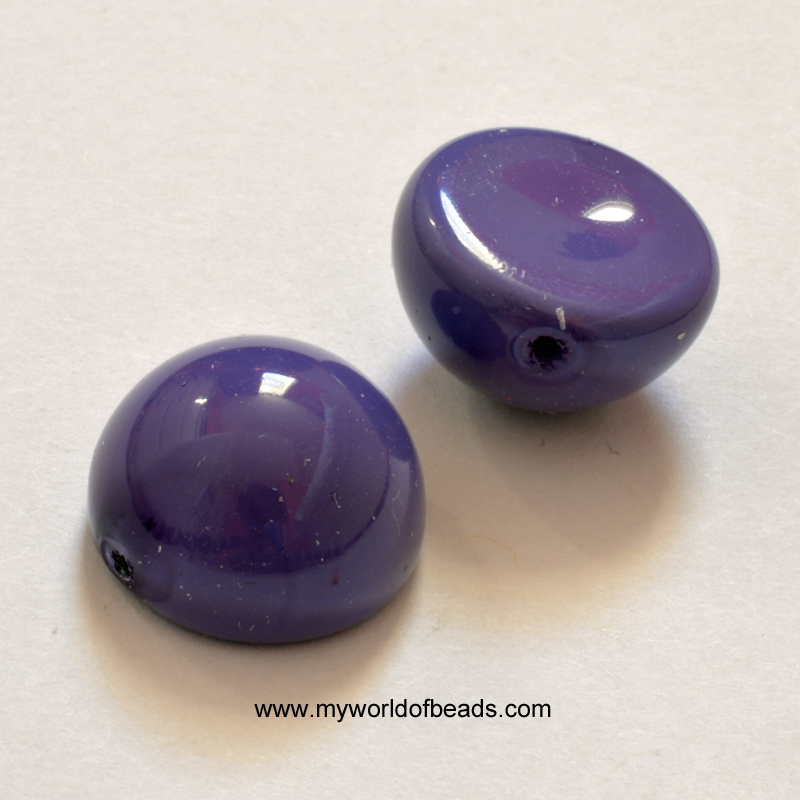
So, lesson number two: mixing shades of a colour can also help to add interest to a design. No problems so far!
How to solve a problem
The next problem – and the really interesting bit – came when I had designed the circular components at the front of the necklace.
I designed first one and tried it. It was just what I wanted, but I really wanted a series of three of these, not just one. So I carefully counted out my chosen Twin Hole beads and Quadra Tiles.
The Quadra Tiles were fine – plenty of those. But I only had enough Twin Hole beads to make two and a bit circles.
Not a disaster yet… Remember, I mentioned I had two different shades of Twin Holes? Well, luckily I had enough beads in the second shade to create one circle. So this forced my hand. A design with two circles in identical colours on the outside and a slightly different colour in the central circle. I actually rather liked this idea, so I went ahead and made the necklace.
Now, take a really close look at the necklace and do you notice anything?
What bead finishes will do…
The colour change in the central circle had a bigger impact than I had imagined. Not only is it obvious that the Twin holes are a different shade, but they actually give the beads around them a different feel as well.
The more pinky hue to the Twin holes seems to bring out a different quality in the Dome bead. So, I think the whole circle has a warmer quality than its neighbours. This draws the eye to the centre of the circle where the warmth lies.
If you look at the outer circles, then you find your eye being drawn more to the outside edges where the purple pearls are the most vibrant colour. Then, it feels like the more blue-ish, more transparent Twin holes fade into the background a little.
There are complex colour theories to explain this. It has to do with the way in which the eye is attracted by intensity of hue, and the way in which the light passes through the more transparent beads. In contrast, light reflects off the more opaque beads.
All of this is great to know if you have the time to study it, but pretty impossible to really calculate as you plan a design. In addition to that, it can be very difficult to predict how bead colours are going to change when they are sat next to other beads. It is also worth bearing in mind that in a tube, you will be seeing the full intensity of a bead colour. Once you see the bead out of the tube and on its own, that intensity can change a lot.
I happen to love my new necklace and I have enjoyed wearing it with my dress, but I can honestly say I had no idea about how the colours were going to play together when I started the design.
So if my little tale about bead colour combinations leaves you as confused as when you started out, you might like to also look at this blog that talks about colour finishes on beads. I also have an online class that will teach you everything you need to know…
Some Tips
1. Create some balance:
Whether you are playing it safe and using just one colour, or taking a risk and trying a bold, complementary colour scheme, remember to create some balance. Whether you use shades of a single colour (monochrome scheme) or pick opposing colours, don’t use them equally. Choose one as a dominant colour and one as a highlight.
If you choose the brightest colour as your dominant colour, then you will end up with a bold design that is just toned down by the more subdued colour. You can liven up a dull colour by using highlights of a bright colour to add interest.
2. Try the beads out:
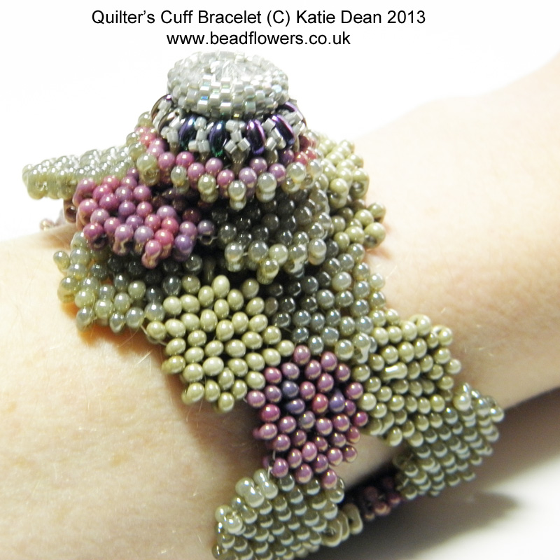
It is so difficult to predict how the beads are going to behave with one another until you try them, so make a few little colour samples and see what happens to the beads. Do they end up fading into the background, or standing out more than you expected?
3. Don’t be afraid:
We all get stuck in a colour rut. We either see a design in colours that work, buy the pattern, make it up and then continue using those colours in other projects. Or we stumble upon bead colour combinations we like. This could be a combination that has been suggested by something else – perhaps an outfit or something in nature. However, you came by it, you feel safe sticking with it.
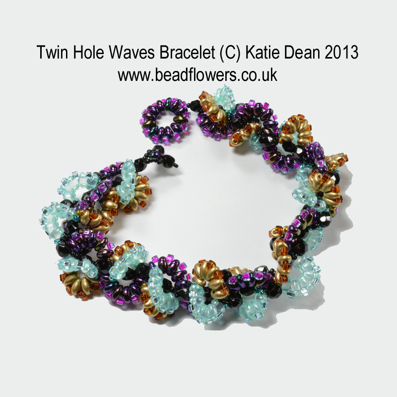
Well, try mixing in something different. If you get to know the colour theory basics, you can feel confident knowing that there are certain schemes that will work.
So keep to some of the colours that you know. But mix them with a new tube of beads and see what happens. You will make mistakes along the way. Or rather, you will find choices that you personally don’t like. But this will just help you to make more informed decisions.
The more you experiment, the more confident you will feel in choosing those bead colour combinations… And after all, every bead finds its place eventually. So, even those tubes you’ve been hiding in your stash for years will eventually find their perfect colour partner!










Thanks again Katie! I always enjoy reading your posts that remind me to take the time to think a bit about a project before diving into the beadwork!
Thank you Jeanne! I’m always diving straight into the beadwork without thinking first, but it sometimes creates some interesting results…and there’s nothing wrong with that 🙂
I am thrilled Katie. I am do beads as my favourite hobby and you have boosted my morale . Thanks yeah. Am gonna share this with my friends and family .
Thank you Jessica – it means a lot to hear that I have helped you. Beading is such a fabulous hobby, so I’m glad to hear this has given you a boost! Thanks so much for stopping by and happy beading!
Katie
Beautiful colors that fit together so perfectly.Thanks for the post