Finding Bead Colors That Look Good Together
Do you have trouble finding bead colors that look good together? Are you one of those beaders who feels like their finished pieces always seem to have color clashes? Well, if you said ‘yes’, then you’re not alone. Creating colour schemes is actually one of the hardest parts of beading. So, what can you do about it? Well, happily, I have a solution here.
Why is it so hard finding bead colors that work?
Now, it’s fair to say that some people just don’t have a lot of confidence with colour. So, for them, even just being asked to pick a colour for an outfit can seem like a challenge.
But the good news is, some very clever people over the years, have put together simple rules that anyone can follow.
It all starts with the colour wheel. Once you know what that is, it’s easy to choose your first colour, then find a colour that will naturally make a good partner.
But, then come the beads. And you get a whole new level of difficulty. So, what is it that makes finding bead colors that work so difficult? To my mind, it’s a little thing called value!
The complexity of value
Those gorgeous little pieces of glass make everything so much more complicated. You see, if you’ve ever read my article on simple colour theory (and if you haven’t, it’s worth a read, so here’s the link), you’ll have heard me talk about value.
This is basically how light or dark a colour appears. Well, it’s complicated enough when you’re talking about paint. But beads are made from glass. And glass reflects and absorbs the light. So, the different colour finishes on a bead have a huge impact on how they look.
When you see them all together in a tube, they look a particular way. Collectively they are playing with the light on them. But when you take them out and use them individually, the light (and thus the appearance) changes.
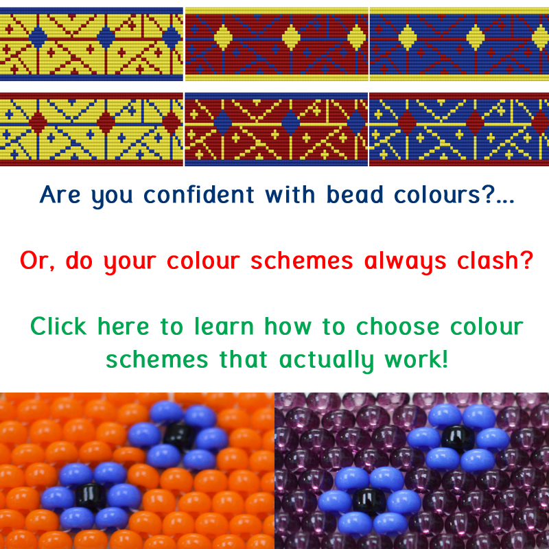
If you remember, I mentioned there is another problem with value. It’s not a ‘static’ thing. The value of a colour changes according to what it sits next to. So, a light colour will appear to have a high value on its own. But if you sit it next to an even lighter colour, then the value of your first colour goes down.
For example, sit yellow next to red and yellow has a high value. But if you then sit the same yellow next to white, the yellow has a low value and the white has the higher value.
Mind-boggling, isn’t it?!
So, how do you deal with all this?
How to find good colour schemes
You could spend your life studying colour theory and working out how to systematically apply that to your beads. But I’m not going to recommend that because I think it would be taking away from valuable beading time!
Instead, you really just need to grasp one idea…
The same bead is going to look like a different colour in different contexts.
So, once you understand that, the only way to be sure you’re going to create a scheme that looks good in the end, is to experiment. Like any good scientist, you need some structure for your experiments to be useful. And you need a way to record the results.
If you can do those things, then you will have discovered the magic tool for creating good colour schemes over and over again.
And, don’t worry, I’m not about to leave you hanging here… That would be very cruel of me. I’m telling you all this because I’ve got an online class that will teach you how to create those experiments and record your results.
I’ve designed it specifically for beaders. So, you’ll be looking at how YOUR bead colours work together. I’ll show you how to make small changes to a colour scheme, without ruining the overall effect.
Then, we’ll go a bit bolder and try changing up an entire scheme, and also creating something from scratch. So, by the end of this, you’ll be pretty confident in your abilities when it comes to finding bead colors that work.
Where is that class? Well, it’s right here at this link. So, pop on over there, watch the first section to decide whether it will help you, then enrol and enjoy!


