Best Festive Colour Schemes
Are you someone who feels like you struggle to come up with colour schemes for beading? Well, let me ask you this: how do you do with festive colours? Do, you have a scheme each year, or does anything go? Don’t get me wrong, the ‘anything goes’ approach is great. But I thought I would share my two best Festive colour schemes and explain why they work so well.

You can’t beat the classics…
That’s right! These two beaded ornament covers actually summarise the two best Festive colour schemes that I know!


(If you need them, you can find both beaded ornament tutorials here)
They are two classics:
- red and gold
- blue and white/silver
But what makes them such classic colour combinations? Well, because they work so brilliantly!
To find out why, we need to think about basic colour theory…
Why the best Festive colour scheme work
Before we plunge into colour theory, let’s take an idea. We all attach emotions, temperature, memories, and a whole lot of other things to colours.
So, it’s entirely possible that your personal attachments may differ from someone else. However, if we take the ‘classic’ ideas here for a second, think about this…
Red and gold are warm colours.
What do we want in the cold, dark winter months? A bit of warmth of course. So, that probably explains why these are such a classic Festive combination.
Blue and white (or silver) are cold colours.
We associate those with snow and ice. So, it makes sense to use them in winter.
Of course, their polar opposites are also true… So, you might want cool colour shades to bring down the heat in the summer. Or, you may prefer warm shades to reflect the warmth of the sun.
But, I think both these colour schemes play on our emotional connections, albeit sub-consciously.
Colour theory
Although these two schemes might appear to be polar opposites, they have something very important in common.
When we think about colour theory, these are both examples of a complementary colour scheme. That is, using two colours that sit next to one another on the colour wheel.
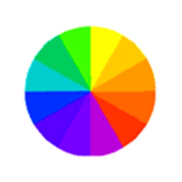
If you’re looking for ‘good’ colour schemes that will always work, then this is a pretty fail-safe option. In fact, you can see this immediately by looking at a colour wheel. The similar colours sit next to one another and work well together. They have a sense of balance between them.
So, you can be sure that both these colour schemes will always ‘play nicely’ together.
How about you?
Well, I started out by saying that there’s nothing wrong with any colour scheme. I happen to think these are the two best Festive colour schemes, but what about you?
Do you have a particular scheme in your home (or office), or is it a case of ‘the brighter, the better’?
After all, the other easy way to brighten up the dark and gloom of a Northern winter, is just to add as much colour as you possibly can…

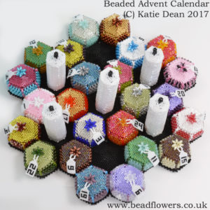
…which is precisely what I did with my Christmas mobile and my Advent calendar. (Again, both these patterns are available here)
If you have some Festive colours schemes, I’d love to hear about them. So, just leave a comment down below. Then, maybe we can inspire some new colour schemes for others to try next year!