
The Dangers of Choosing Bead Colors From Charts
Now, this is not a ‘new’ topic. In fact, it is an issue that has frequently caused controversy in the beading world. But it’s an important issue to discuss from the perspective of design. Specifically, color in design. And the topic is: the dangers of choosing bead colors from charts. So, what am I talking about?

What bead color charts do I mean?
Beading software has come a LONG way since the days when I first started beading. Back then, if I wanted to create a Peyote bracelet, I needed to print off a peyote chart, grab my coloring pencils, and color the design I wanted.
Then, I needed to choose bead colors to represent my chosen coloring. And finally, I had to bead the bracelet by actually reading my colored-in chart.
So, that took a lot of different skills.
- First, the skill of designing a pattern.
- Second, the skill of choosing bead colors that would work together. (If that’s a skill you need to learn, then check out this online class).
- Third, the skill of reading a Peyote pattern chart. (Again, if that’s something you need to learn, I have an online class to teach you those skills too – access it at this link).

Click here to get the tutorial for this beaded bracelet
Beading Software
Then, along came fancy beading programs. I’m thinking of things like BeadTool.
This amazing software does everything for you. First, you select the kind of graph paper you need. Then, you select your bead colors and create your pattern design. Finally, press a button and the software generates a word chart that saves you having to read your pattern chart AND gives you the exact bead colors you need to buy.
Literally miraculous!
And, at first appearances, a tool that can let you create a bracelet pattern (say) in under an hour. You can generate an image of the pattern that looks a lot like the finished bracelet. And then you can sell your image and word chart without ever picking up an actual bead.
Nice work if you can get it, right?
The dangers of choosing bead colors from charts
Not so fast…
If you’ve ever worked with beads, then you’ll know just how tricky it is to put together color combinations that really work well.
You’ll also know that the bead colors look different when you use them to how they look in their tubes. (If you want to know why that is, then check out this blog post).
I’m sure you have also realised that bead colors look different on a computer screen to how they look in a tube. So, with all these different renditions of the same bead, how has the software managed to generate the miracle of creating a color combination that works?
The answer: it hasn’t.
You see, it isn’t able to replicate the way in which light plays on the beads. Nor can it convey the subtle color variations in something like an Iris, or AB, or Picasso finish.
Now, this isn’t in any way a criticism of the software. It does a brilliant job in creating a starting point, and, best of all, that word chart to follow.
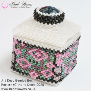
But take a look at these two images and ask yourself how well the chart represents the beads…
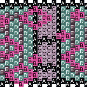
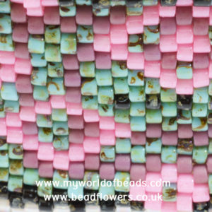
To my eye, the pink of the beads looks very different from the pink in the chart (‘B’ beads). And as for the ‘E’ beads in the chart…do they even look like the mauve/purple areas you see in the photo? The photo doesn’t show the ‘C’ beads from the chart at all, but it does show you three of the ‘A’ beads – can you spot them?
What if I hadn’t beaded any samples?
I’ve also missed out a part of the story here. My original chart used five bead colors that I had hand-selected from my actual stash. That created a chart that looked like this:
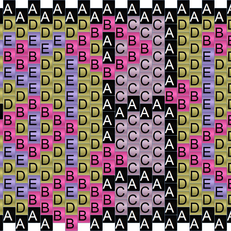
Now, I thought that looked pretty good on paper. But I knew I needed to test the bead colors before I committed to making my beaded box.
And, it’s just as well that I did. I began making little samples, and found that the ‘D’ beads – that lovely bright green/yellow that makes a great highlight in the pattern – just got lost in the sample…
So, I began swapping out colors until I had a selection that I felt worked in the beads. Then, I went back and changed my pattern chart to reflect this. But, I think the pattern chart (the original image I showed you) actually looks duller and less interesting than the beads.
The important thing is that the beads work, not that the pattern chart works.
Why does any of this matter?
To be honest, maybe this doesn’t matter to you.
But I do know beaders who have spent their money (money they could have spent on beads or another tutorial), on a tutorial that had never been tested in actual bead colors. A tutorial that had simply been generated from a color chart. Rather than being thrilled with their resulting project, these beaders felt disappointment as the color scheme in the beads looked less impressive than it had done in the chart.
Now, this is very much a matter of opinion. Everyone sees their bead colors differently. I think people also have different expectations of what their end result will be. So, I daresay, for every disappointed beader, someone else enjoyed that un-tested project.
I’m not condemning anyone here. Neither am I preaching to anyone to work in a specific way. We all make our own choices and for our own reasons.
All I want to say is this…
Bead colors are a law unto themselves. They are unpredictable, and that’s what makes them so fun (and frustrating) to work with. So, do not be fooled into the idea that a color chart on paper can give you a good representation of an item of beadwork. Just be aware of the dangers of choosing bead colors from charts.
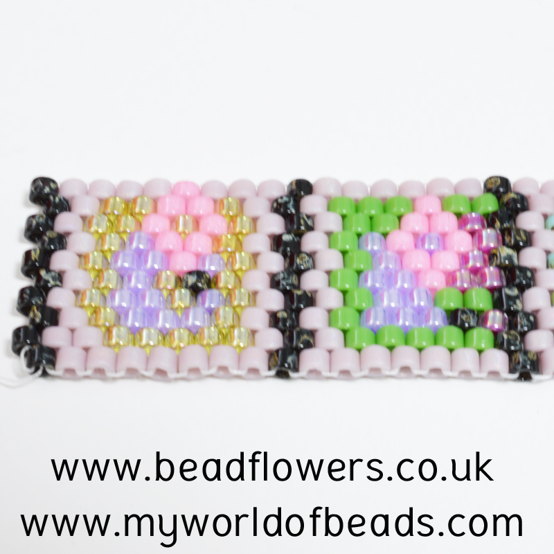
And, this, by the way, is the finished box for which I was generating that chart…
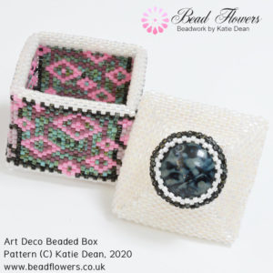
Click here to get the Art Deco beaded box pattern
Advice for designers
I ‘get’ the temptation to generate your pattern chart and word chart and not spend the time agonising over bead colors. If you choose to follow that route, just make sure it’s a conscious decision and you know about the dangers of choosing bead colors from charts. Make sure you are prepared to have some disappointed customers to deal with if you’re selling your tutorials.
And remember, disappointing a customer once doesn’t always just stop there. It will almost certainly guarantee that they don’t come back to purchase from you again. But, in this age of social media, it may also mean they share their feelings about your product across online beading groups.
So, all I’m saying here is, be aware and make a conscious decision. Don’t end up ruining your business because you simply didn’t understand how all this works.
Advice for beaders
If you see a tutorial that doesn’t show the finished product – or at least a sample – in actual beads, then be wary.
If you’re happy selecting your own bead colors, then purchase the tutorial. At least, if the bead colors on paper don’t look good in reality, you’ll have the skills to take the time to make substitutes that work.
But if you rely heavily on someone else choosing colors for you, then just be aware. If you can’t see evidence of how the colors look in beads, you may get some surprises. You may also find you have purchased beads for the project, but don’t like the end results. And would you know how to make some swaps that will work?
And, if this is advice that helps you in some way, please share it with your beading buddies by sharing this article online.


The main problem is you often don’t know if the maker of the pattern has made up an actual item! Sometimes you can see in the front pic but def. not always
I also wish patterns told you how many colours were used, prior to purchase. I bought an abstract design peyote bracelet pattern, thinking about 20-25 colours. Turned out to be 102 !! Most only needed 2 or 3 beads in that colour but still…
BTW I find these articles extremely useful and interesting. Thank you Katie 🙂
Yes – the way the software generates an image from a photo is amazing, but not always so practical! Personally, I would spend some time switching in or out some of the colors before I published a design. To be totally honest, having 3 odd beads in a slightly different color is probably not going to ‘make’ the image, but it will ‘break’ your bank if you’re having to buy all those extra beads! So, I like to look through and check where I can make ‘sensible’ amendments to create something practical.
Hazel I completely agree with you. Bead counts of the different colours would be good too. One pattern I bought used about 5 different greens and 4 different ‘skin’ colours it had so many colours that unable to order in less than 5 grams of each it cost me over £100 pounds to get all 40 colours needed (although I did have some in my extensive stash). It is also annoying to get the colours in in 5gm lots only to find that it uses 6 gms. I do find that bead tool uses far too many colours. so if a designer uses that particular programme, you are in for trouble
I agree, Sharon. But I also think that the onus is on the designer to exercise some common sense. You don’t have to use all the colors as BeadTool tells you. Personally, I use the software to generate a basis, then spend the time altering that to make it feasible to actually bead. So, that process takes an awfully long time, but it’s worth it to generate a pattern that is practical to use, I think.
Matte opaque beads are the only ones that do not magically change when put next to one another. But this limits the color selection to basics. I had no idea that people were using the color charts from bead design programs as if they were reliable. Even actual beads from one’s stash are not reliable depending which line of the design the artist wants to accent.
Yes, unfortunately, a lot of people don’t fully appreciate that the software is a tool to help with producing a pattern, not a substitute for doing the basic design work.
I found your article very interesting and am glad I’ve seen it, I have recently been working on beading patterns that I have listed online and sold. I can safely say that I have not only chosen the colours, I’ve beaded the pattern so others can see the finished item. Reason is that I can’t always see the different colours on a colour chart on the computer plus my range of colours is not as extensive as some I have seen. So I try to keep that in mind and limit the number of colours I use.
It sounds like you’re doing a great job, Rachel. I’m really glad you found the article helpful. Thank you.
A great article. I have found, I choose my palette ahead of time, choosing the actual beads I’m going to use. My issue, is shading. The finishes of different beads, create various looks. Shading is such an issue with me. Does some body know of info on this. Something to read up on? I really want to hone my skills on this. Thanks in advance.
Thank you Paulette.
You are right – shading is the biggest issue. Both the bead finishes and also the bead placement contribute to how they look. So, this is such a complicated process that it’s not really something you can ‘read about’. You can certainly take a look through the other articles on here, in the colour section. In particular, the articles about the ways in which bead finishes play with light. But really the only way to work this out is through experimenting with the actual beads.
I do teach a course which gives you a simple structure for setting up those ‘experiments’ effectively. So, you can find what works more quickly, rather than taking a guess and then realising mid-project that things aren’t working. So, that might be a really good option for you. You can find the details at this link: https://my-world-of-beads.teachable.com/p/how-to-choose-bead-colours
That would be my best suggestion for you. Thank you for raising such a good question.
I love seeing your work. I love to bead and never ventured out with something so skilled mainly due to the devastation of failure, I can’t swallow. Anyway the more I see your work the more that little girl in me wants to dip my toe in the lake.
Oh Laurie! I’m so happy this is inspiring you. But I also feel a little sad if you’re holding back through fear. There really is no such thing as failure in beading. The joy comes from the process. Never judge the end results. And you don’t even have to show them to anyone. So, please, let that little girl out to play…it will do you so much good, and that benefit will flow out in other areas of your life too. I hope you’ll be brave <3