
Color Intensity in Beading
Have you ever opened a tube of beads and started using them, only to discover that the color of the individual beads looked nothing like the color in the tube? Frustrating, isn’t it? How on earth can you decide on which colors to use in your beadwork if this keeps happening? Well, I’m afraid I can’t do much to stop it from happening. But I can explain why this problem occurs and what you can do about it. So, in today’s post, we’re going to take a look at color intensity and what that means for your beads.

What is color intensity?
Now, color intensity often gets confused with color value. I’ve examined color value in another post, which you can read at this link.
It’s easy to see why. Value is a measure of how light or dark a color appears in relation to the colors around it. The intensity of a color will affect its value, but it’s not the same thing as the value.
Color intensity is the measure of the ‘purity’ of a color. So, if you take a pure red, you can make it less intense by mixing it with white – you’ll get something that you might call pink. This reduction of intensity can also be referred to as a ‘tint’.
You can take the same red and add black to create a darker intensity. You might label this color as maroon. It is also known as a ‘shade’
Thirdly, if you mix the red with a grey, it will ‘muddy’ the original. The technical term for this is a ‘tone’.
(And, while we’re talking technical terms, if you ever see the term ‘hue’, it is simply the technical term for ‘color’.)
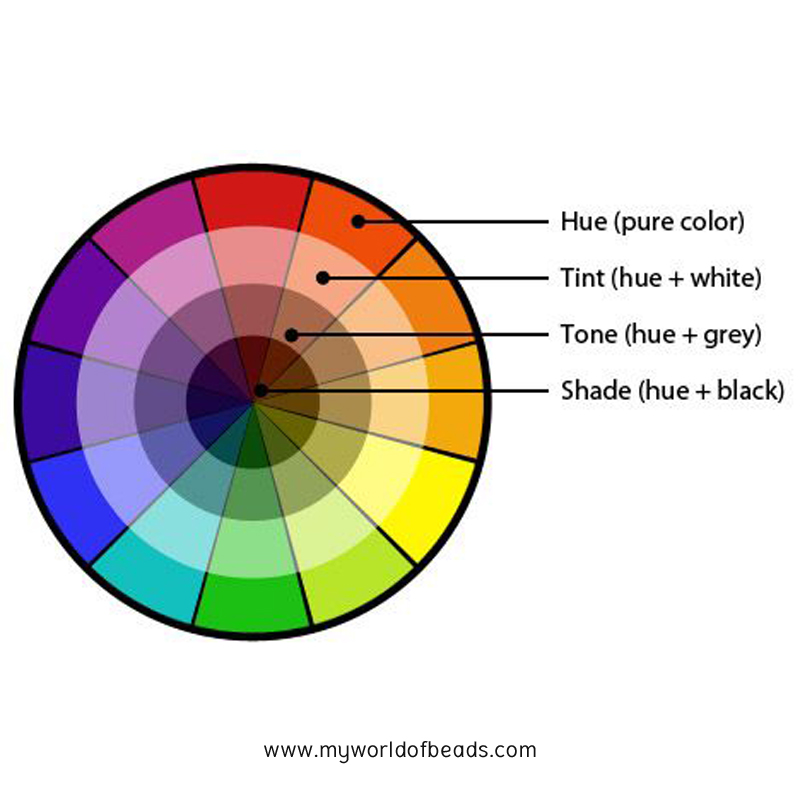
So, you can display your color wheel with the tints, tones and shades shown in addition to the original color. Looked at in this way, you get to see the range of intensity across any given ‘pure’ color.
So far, so good. But why does that create complications?
Intensity of colors within a color scheme
As with the value of a color, the intensity appears different when it is placed next to other colors.
Take the example below. I’ve drawn a square of ‘pure’ purple. When I place it in the middle of a rectangle of ‘tinted’ red (light red, or pink), the purple appears dark and vibrant. But when I put the same square in the middle of a more intense shade of the same red, the purple square gets lost and appears to have a low relative intensity.
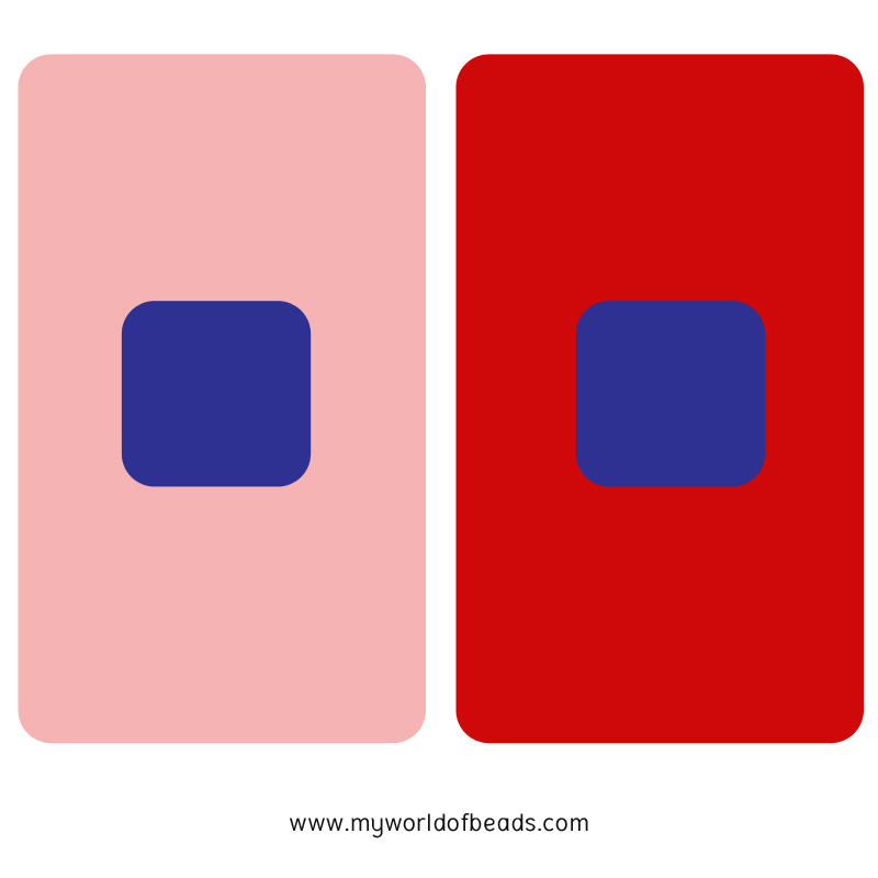
So, as with value, the intensity of your color is going to depend on what it’s sitting next to.
That’s all very well with fabric, or thread, or paint. But when it comes to beads, you start to hit additional complications. You see, because beads are made of glass, the way in which the light plays with them will further affect their intensity. So, let’s take a look at that and what you can do about it.
How does this apply to beads?
The easiest way to try and explain color intensity of beads is to look at how much they are affected by light. So, does the bead tend to reflect light, absorb light, or allow the light to pass through it?
Well, the answer to that depends upon the finish of the bead.
So, a silver-lined, or ceylon, or satin, or metallic finish will reflect light. That can have the same impact as creating a ‘tint’ to a color. Suddenly, the light is reflecting back off the bead. That makes your eye less aware of the basic color, so has the effect of reducing the intensity.
A matte or opaque bead will absorb the light. So, it can appear darker, or simply just more ‘true’.
A transparent bead, even if it’s got a rainbow or matte finish, is going to allow light to pass through it. So, again, its intensity will be reduced.
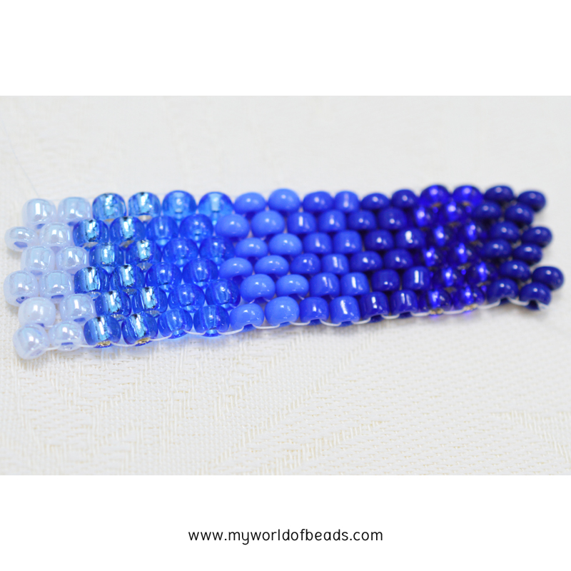
In the color strip above, I’ve tried to grade my blue size 8/0 seed beads according to their intensity. But when it comes to the transparent, ceylon and silver lined beads on the left, it’s hard. The silver-lined beads (second from left) are reflecting so much light that they lose their intensity of color. But are they really lighter than the transparent bead next to them?
The impact of bead tubes, thread, and more
Suddenly, this color intensity isn’t just about the tints, tones and shades of the color. Now, we’re also looking at light, and thread.
You see, your beading thread is going to effect the color of your beads too. This may be obvious if you’re talking about colored thread and transparent beads. But even if you’re using matte beads, the thread is still creating a shadow through the bead which will affect how the light plays with the glass.
And the light and intensity is the reason why beads look so different in a tube or packet to how they appear when you’re working with an individual bead. In the tube, the beads mass together and don’t allow the light pass through them. So, you get a much more intense color.
Once you take out individual beads, they will allow more light through, which appears to lighten them. In other words, to reduce the intensity of their color.
Intensity within a color scheme
Now, you’ve just seen how the intensity of a color seems different when it’s placed against other colors. You’ve also just heard how much more ‘volatile’ beads are when it comes to color. So, what happens when you use the same bead in two different color schemes?
Well, literally, everything can change!
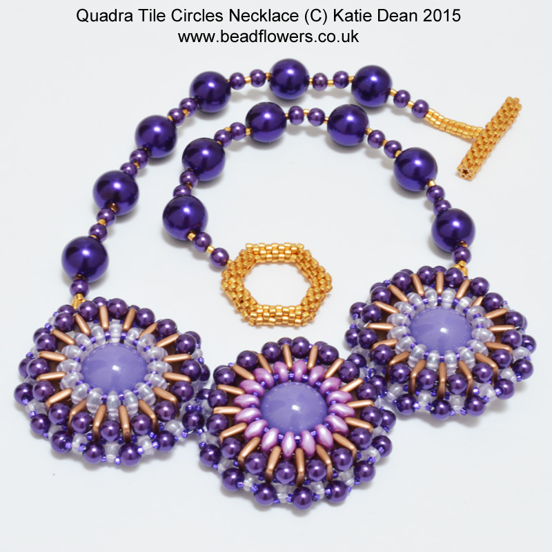
Click here to get this necklace pattern
This is actually a topic that I explored in an earlier blog post. I created a necklace and partway through, ran out of beads. So, I had to make a bead substitution. Although I chose a bead that was the same basic hue, it had a different finish. So, this affected its intensity. And, in turn, that affected the look of the entire element within my design.
Happily, this proved to be positive, adding to the interest of the design. But the results weren’t necessarily what I had anticipated. I’ve shown the necklace above, but do take a look at the full story in this blog post to help you understand about how your beads can ‘play’ together.
How to work successfully with color intensity in your beading designs
So, I’m sure you’re all too familiar with the problem. I’ve just explained to you what causes it. But what can you do about it? How can you stop beading designs then realising that the colors don’t work? How can you be more confident in how the beads will look when you get them out of their tube?
Well, in part, you can put this knowledge to good use. So, you can be sure that certain color finishes are going to look very different out of the tube compared to how they look in it. For example, it is a given that a transparent bead will lose its color intensity once you take it away from its mates. So, it is best used in large quantities to cover an area so that you give it back some of the lost intensity.
A matte or opaque bead isn’t going to change very much between tube and beadwork. So, those finishes are quite ‘safe’ to work with.
But, if you want to create an interesting design, you need a range within it. We discussed this in the blog on values. So, follow this link and re-read that to refresh your memory. Although it might feel ‘safer’ to work only with opaque beads, you’re going to end up with designs that can lack interest. You really want to use a few different finishes to add some contrast in intensity and value.

How to create interest in your designs
If that leaves you with the question of how much you can risk, then I’ve got the answer. You don’t have to risk an entire piece of beadwork in this color experiment. I actually have an online class that gives you a simple 3-step framework for creating and testing your color scheme BEFORE it gets as far as your actual beading project.
So, you can be pretty secure that your design will work. And you can access the class right here. Work in your own time, at your own pace. Plus, you can re-use the material over and over. So, you can keep coming back to follow the class any time you want to create a successful combination of bead colors.